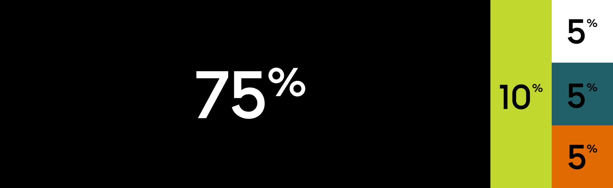
In dark mode, brand graphics are typically used as the background, but solid black or slate can also be applied when a simpler treatment is needed.

Colour
Palette
- CMYK:
- 0 0 0 100
- RGB:
- 0 0 0
- Hex:
- #000000
- CMYK:
- 9 0 78 16
- RGB:
- 193 214 46
- Hex:
- #c1d62e
- CMYK:
- 68 8 0 58
- RGB:
- 33 96 105
- Hex:
- #216069
- CMYK:
- 0 53 100 12
- RGB:
- 224 105 0
- Hex:
- #e06900
- CMYK:
- 67 50 0 78
- RGB:
- 18 27 55
- Hex:
- #121b37
- CMYK:
- 0 0 0 90
- RGB:
- 25 25 25
- Hex:
- #191919
- CMYK:
- 0 0 0 30
- RGB:
- 178 178 178
- Hex:
- #b2b2b2
- CMYK:
- 0 0 0 9
- RGB:
- 230 230 230
- Hex:
- #e6e6e6
- CMYK:
- 0 0 0 0
- RGB:
- 255 255 255
- Hex:
- #ffffff
Colour ratio
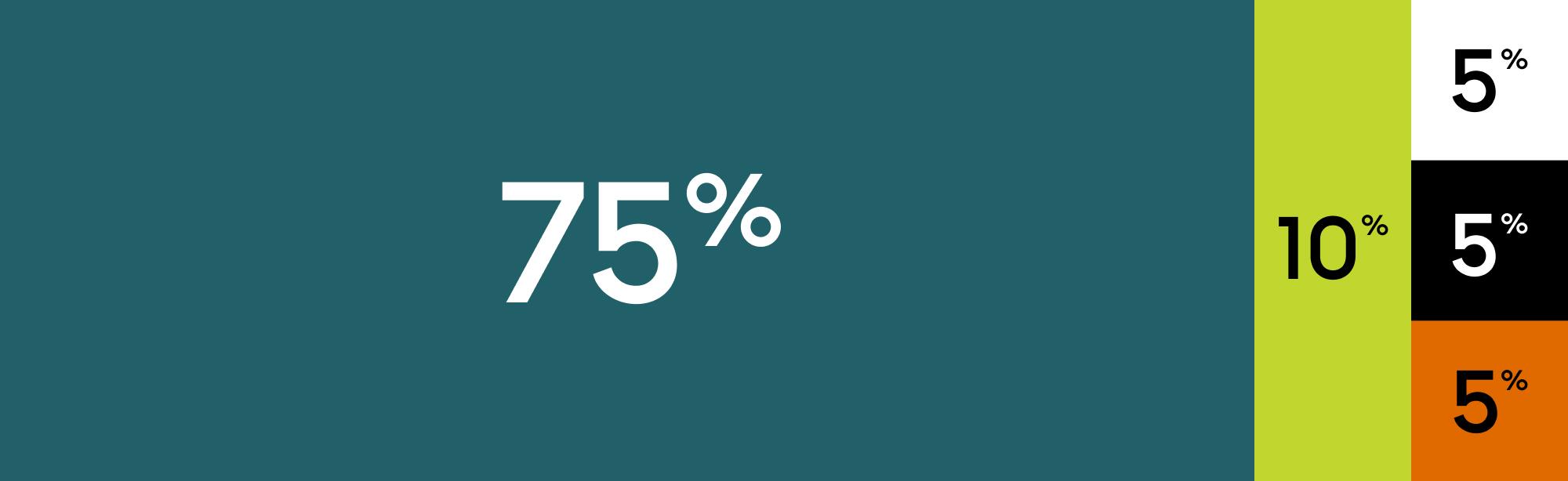
You can use either light or dark modes of the colour palette. The primary accent colours are inverted between modes to maintain contrast and consistency. There are additional colours outside of the main ratios listed below that can be used as tertiary shades to add depth and flexibility. Wherever possible, lean on the brand graphics to lead the visual expression, with colour used to support rather than dominate.
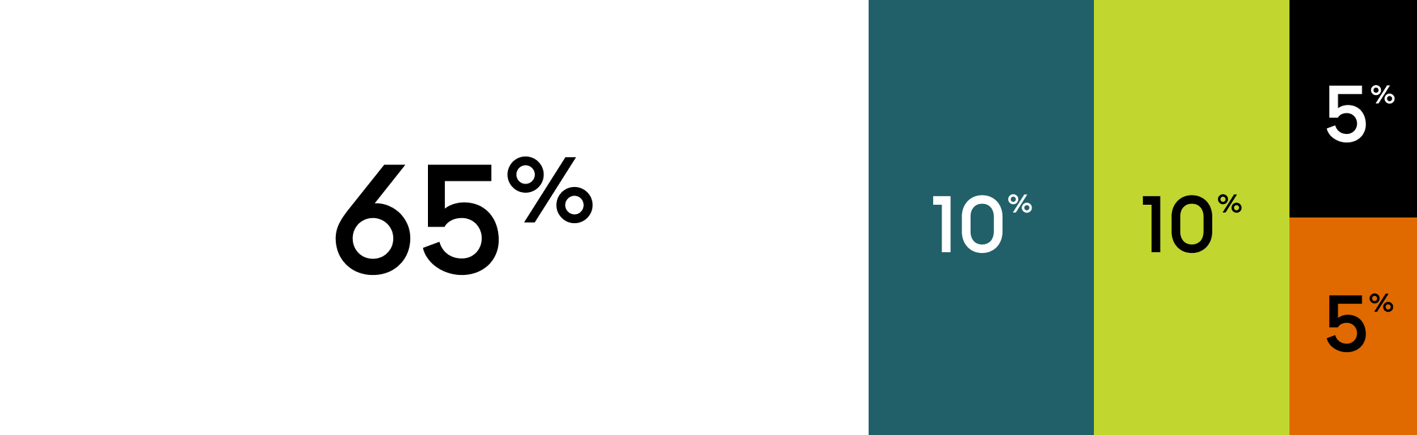
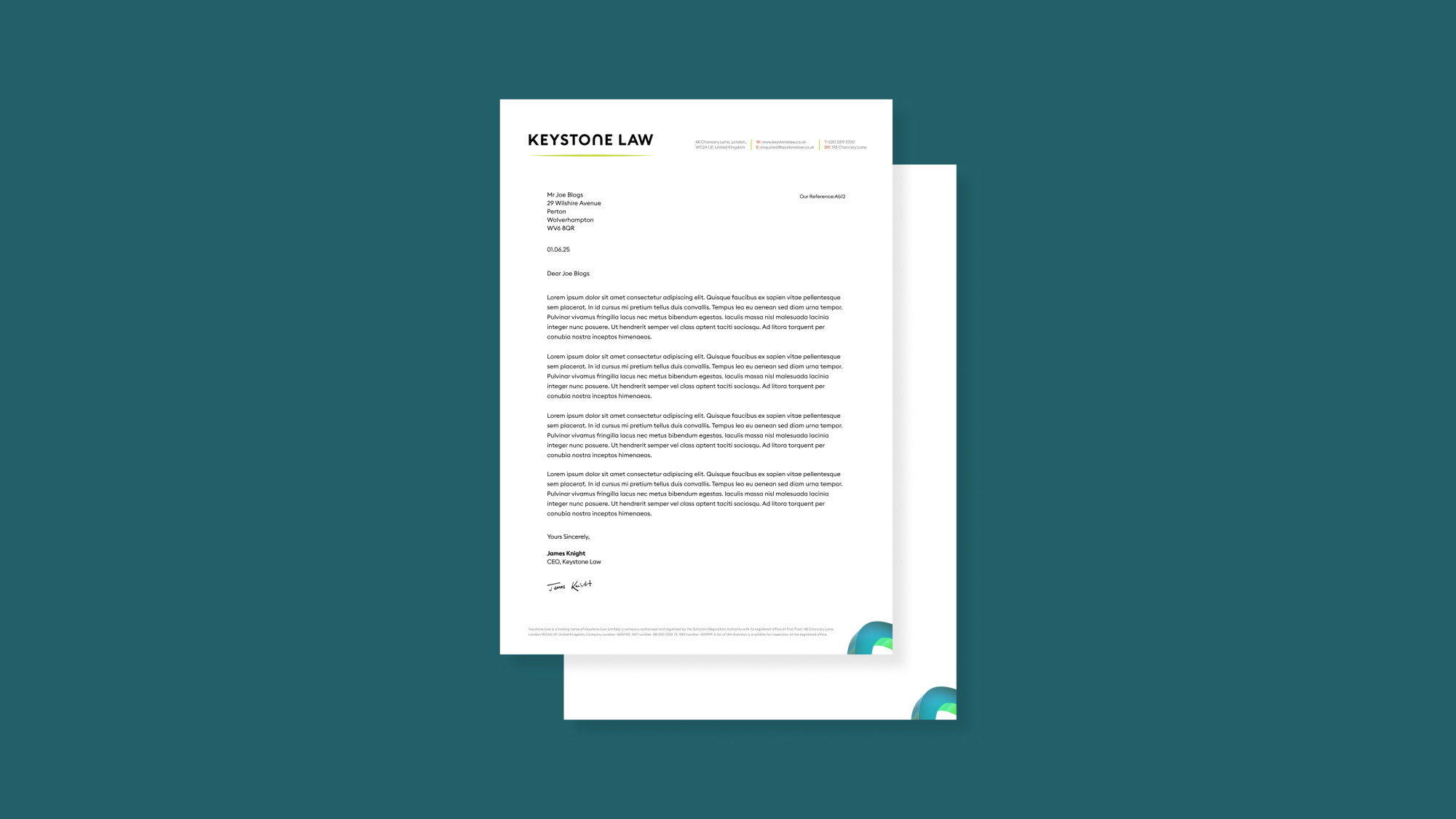
In light mode, the background remains predominantly white or neutral, making it better suited for long form text and content heavy layouts.
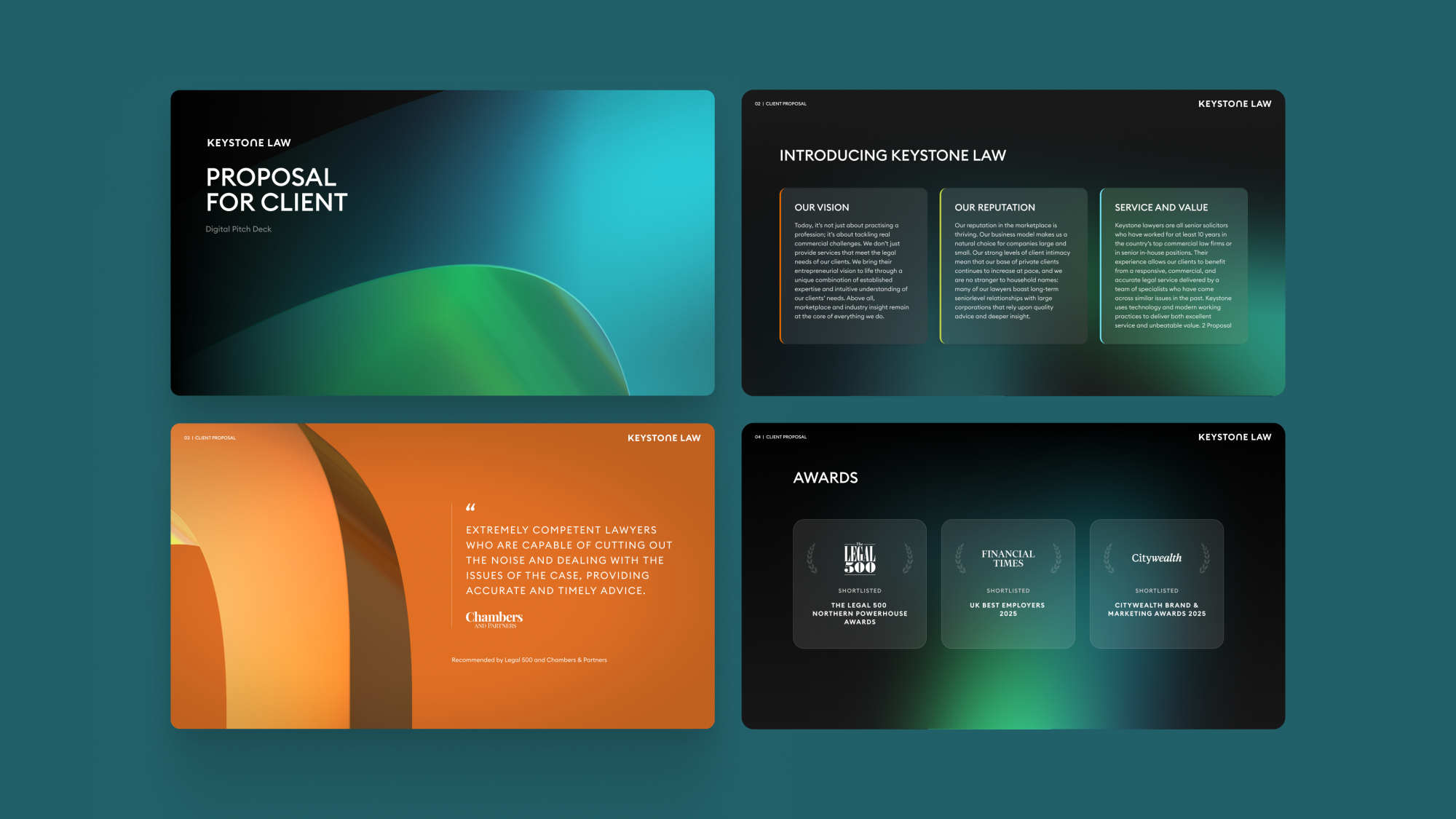
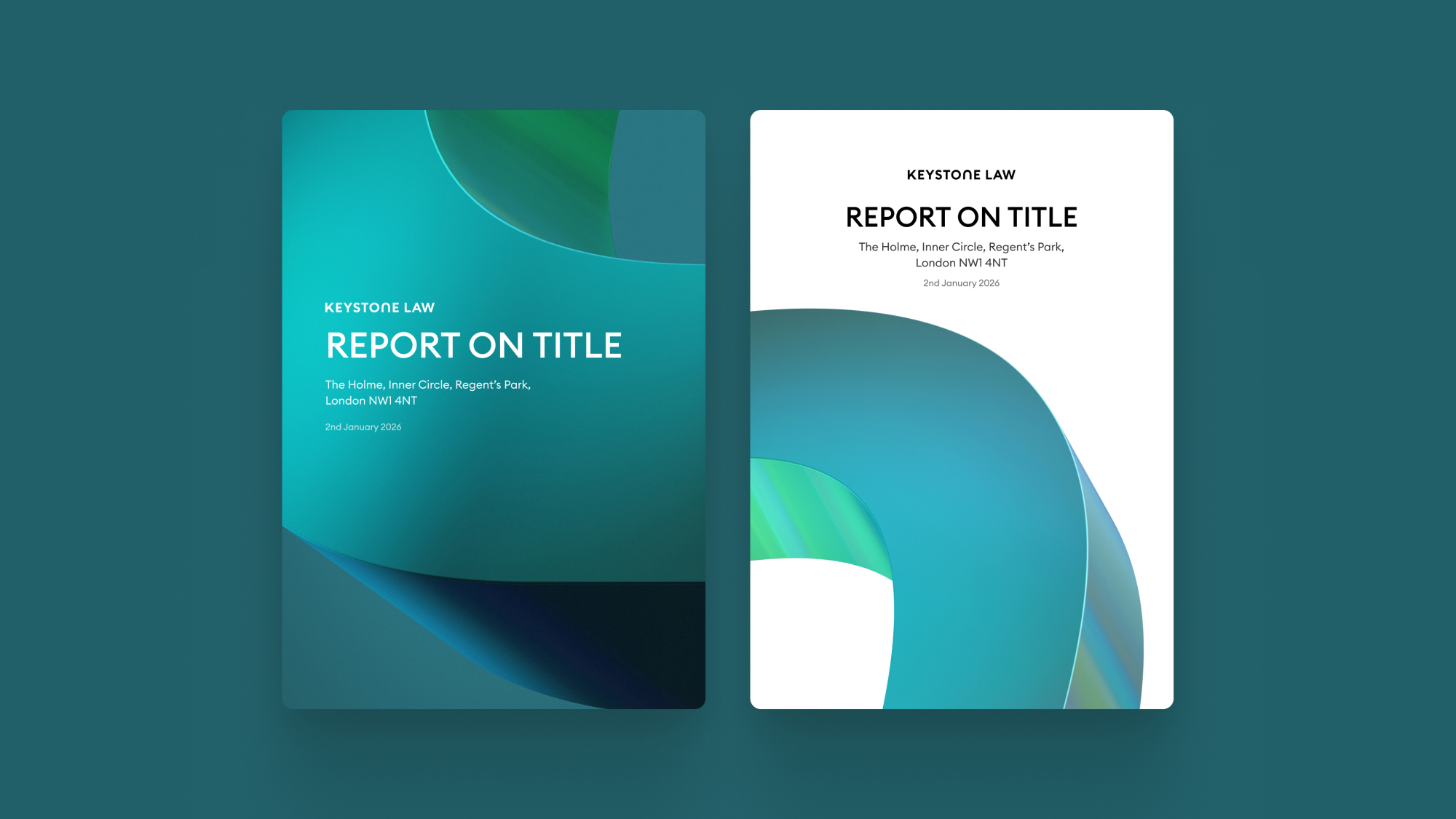
Colour application
Here are some examples of how to apply our colourway to varying applications.